Plenty of brands ship A+ Content once, then never look at it again. It sits below the fold, quietly converting  or quietly not converting  for years. The problem is that A+ rarely fails loudly. It just under-performs: a module that reads as a wall of text, a comparison chart that renders as mush on a phone, a benefit the buyer needed to hear that nobody thought to include. An audit is how you find those silent leaks. This is not a guide to building A+ from scratch; it is a structured pass over A+ that already exists, to find what is missing, broken, or wasted.
Key Takeaways
- A+ Content usually under-performs quietly, so it needs a deliberate audit rather than waiting for a complaint.
- Audit five things: module mix and job, mobile rendering, text redundancy, missing answers (comparison and cross-sell), and accessibility and brand consistency.
- Most of your shoppers are on a phone; if a module only works on desktop, treat it as broken.
- Every module should do a job the bullets and gallery do not already do  repeating the bullets in prose is wasted space.
- The fastest wins are usually a missing comparison module and image text that no screen reader or shopper can parse.
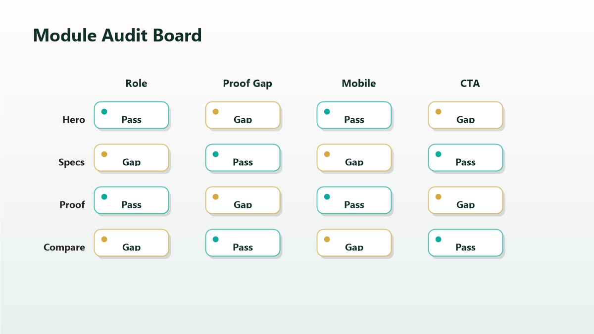
Audit Dimension 1: Module Mix and Module Jobs
Open the listing and list every module and the one job it does. A healthy A+ layout tells a sequenced story  who the brand is, the headline benefit, how it works, how it compares, what is in the family  without two modules fighting for the same job.
Red flags: three text-heavy modules in a row with no rhythm; a hero banner that says nothing specific; a layout that opens with fine print instead of the strongest reason to buy. What good looks like: a clear lead module with a concrete benefit, varied module types for visual rhythm, and a deliberate end (comparison or cross-sell) rather than a fade-out.
Audit Dimension 2: Mobile Rendering
This is the dimension most desktop-built A+ fails. Modules that look elegant on a wide screen can stack, shrink, or truncate on a phone, and text baked into images can become unreadable. Open the live listing on an actual phone and check: Does every module still make sense stacked vertically? Is image text legible without zooming? Do multi-column comparison charts survive the narrow layout, or collapse into noise?
If a module only communicates on desktop, it is communicating to a minority of your traffic. Rebuild it for the phone first.
Audit Dimension 3: Redundant and Wasted Text
A+ should add information the bullets and description cannot. A common defect is A+ that simply restates the bullets in slightly longer sentences  the shopper has already read that. Scan each text block and ask: is this new, or a paraphrase? Replace paraphrase with something the rest of the listing does not provide: a how-it-works detail, a use-case the bullets skipped, an objection handled, a material or sourcing story that builds trust.
Also watch for filler superlatives and unbacked claims. A vague "best-in-class" earns nothing; a specific, verifiable detail earns belief.
Audit Dimension 4: Missing Answers  Comparison and Cross-Sell
Two high-value modules are frequently absent.
A comparison module  your variations side by side, or your product against the obvious alternative  closes the "which one is right for me" hesitation that otherwise sends shoppers off to compare manually. If you sell a range and have no comparison module, that is usually the single highest-value fix.
A cross-sell or family module keeps a shopper inside your brand instead of bouncing to a competitor for the companion item. If your catalog has natural pairings and your A+ ignores them, you are leaking revenue to rivals.
Audit Dimension 5: Accessibility and Brand Consistency
Accessibility: image alt text in A+ helps both assistive technology and, in some contexts, comprehension. Audit whether image text is also expressed in actual alt text rather than locked inside the graphic. Check contrast  pale text on a busy photo fails for many readers.
Brand consistency: across modules and across your catalog, do colors, fonts, logo treatment, and tone read as one brand? Mixed eras of A+ (built by different people at different times) make a brand look incoherent. Note where the visual language drifts.
The A+ Audit Checklist
- Every module has one nameable job; no two modules duplicate a job.
- The first module leads with a specific, compelling benefit  not fine print or a vague banner.
- The listing was checked on a real phone, and every module reads when stacked.
- No image-baked text is illegible at phone size.
- No text block merely paraphrases the bullets.
- A comparison module exists if you sell variations or face an obvious alternative.
- A cross-sell or family module exists if the catalog has natural pairings.
- Image alt text is present and meaningful; contrast passes.
- Colors, fonts, logo, and tone are consistent across all modules and ASINs.
- Claims are specific and verifiable, not superlative filler.
Mini-Scenario: The Chart Nobody Could Read
A tools brand had invested in a polished A+ comparison chart spanning five models  genuinely useful on a laptop. But most of their traffic was mobile, and on a phone the five-column chart collapsed into a thumbnail of unreadable text. Shoppers could not tell the models apart, so they either guessed wrong (and returned) or left to think about it (and did not come back). The audit caught it in two minutes: open on a phone, can you read the chart, no. They rebuilt the comparison as a mobile-first stacked layout with one clear differentiator per model. The information was always there; the phone just could not see it.
FAQ
How often should I audit A+ Content?
At least once a year, and after any catalog change, rebrand, or noticeable conversion dip on a key ASIN. A+ does not expire visibly, so it relies on a scheduled review.
What is the most common A+ defect?
Two compete: comparison charts and other modules that fail on mobile, and text that simply repeats the bullets. Both are common and both are fixable without a full rebuild.
Does A+ Content affect conversion or ranking?
Its primary, intended effect is on conversion. Conversion can influence ranking indirectly over time, but treat A+ as a conversion lever first.
Should every module have a comparison chart?
No  one well-placed comparison module is enough, ideally near the end where the buyer is weighing options. Multiple comparison modules dilute rather than help.
Can I reuse A+ across similar products?
You can reuse brand and how-it-works modules, but product-specific modules (benefits, comparison, contents) should be tailored. Reused A+ that no longer matches the product is itself an audit finding.
Find the Quiet Leaks in Your A+
A+ Content rarely fails loudly, which is exactly why it goes unexamined for years. A structured audit turns a vague "it's fine" into a short list of specific fixes  usually a missing comparison module and a chart the phone cannot read. If you want that audit run across your catalog with prioritized fixes, Qubeq can review your existing A+ against conversion jobs and brief the changes.